.png)
Consumer Portal Branding
Overview
Configurable branding is available for your OIC portals, ensuring that your brand's identity is maintained and you can drive increased adoption within your end users.
Key Features
Update the logo displayed in the header of your portal
Choose a custom title and messaging for the portal landing page
Use colors that align with your branding
Change border radius to suit your look and feel
Getting Started
Portal branding generally takes place during initial configuration of your environment.
Access
To navigate to Portal Branding, click on the cog wheel in the top right of the catalog screen and click ‘Portal Management.'
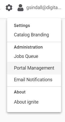
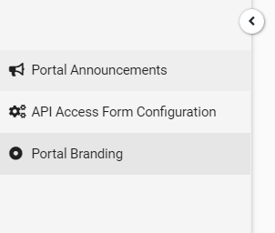
Then click on the ‘Portal Branding’ option in the left hand pane.
How to Use
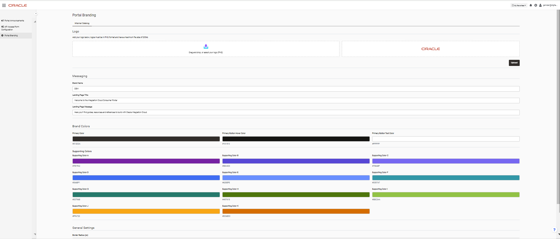
Uploading Your Logo
To upload your logo either drag and drop it into the space provided or click for a file explorer type view where you can make your selection.
Logos should be in .PNG format and have a maximum file size of 200kb.
Your selected logo will then be previewed in the pane to the right, once you are happy simply click the upload button. If you refresh the UI of the portal you are branding you should now see the updated logo.
Example of logo customization
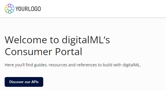
Custom Landing Page Title and Message
To update the title and messaging on the landing page, simply enter your new copy in the ‘Messaging’ section, then click Save at the bottom of the screen. If you refresh the UI of the portal you are branding you should now see the updated messaging.
Example of customized Messaging
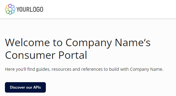
Brand Colors
To update the brand colours used throughout the portal, select colours that match with your branding in the ‘Brand Colors’ section, then click Save at the bottom of the screen.
The ‘Primary Color’, ‘Primary Button Hover Color’ and ‘Primary Button Text Color’ are used to style the button elements throughout the portal, whereas the supporting colors ‘A' to 'K’ are used to highlight other areas such as search result cards.
If you refresh the UI of the portal you are branding you should now see the updated colors.
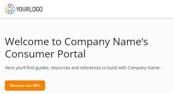
Example of customized Primary Color buttons
General Settings
Finally, you are able to adjust ‘Border Radius’ throughout the portal, this enables you to match the style of your branding, simply select a new border radius value, then click Save at the bottom of the screen.
Border radius affects how rounded the corners of elements appear on the screen such as buttons and search cards. Border radius is measured in pixels (px) and can be any number between 0 and 16.
If you refresh the UI of the portal you are branding you should now see the updated border radius.
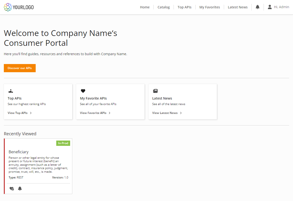
Example of Border Radius set at 0px
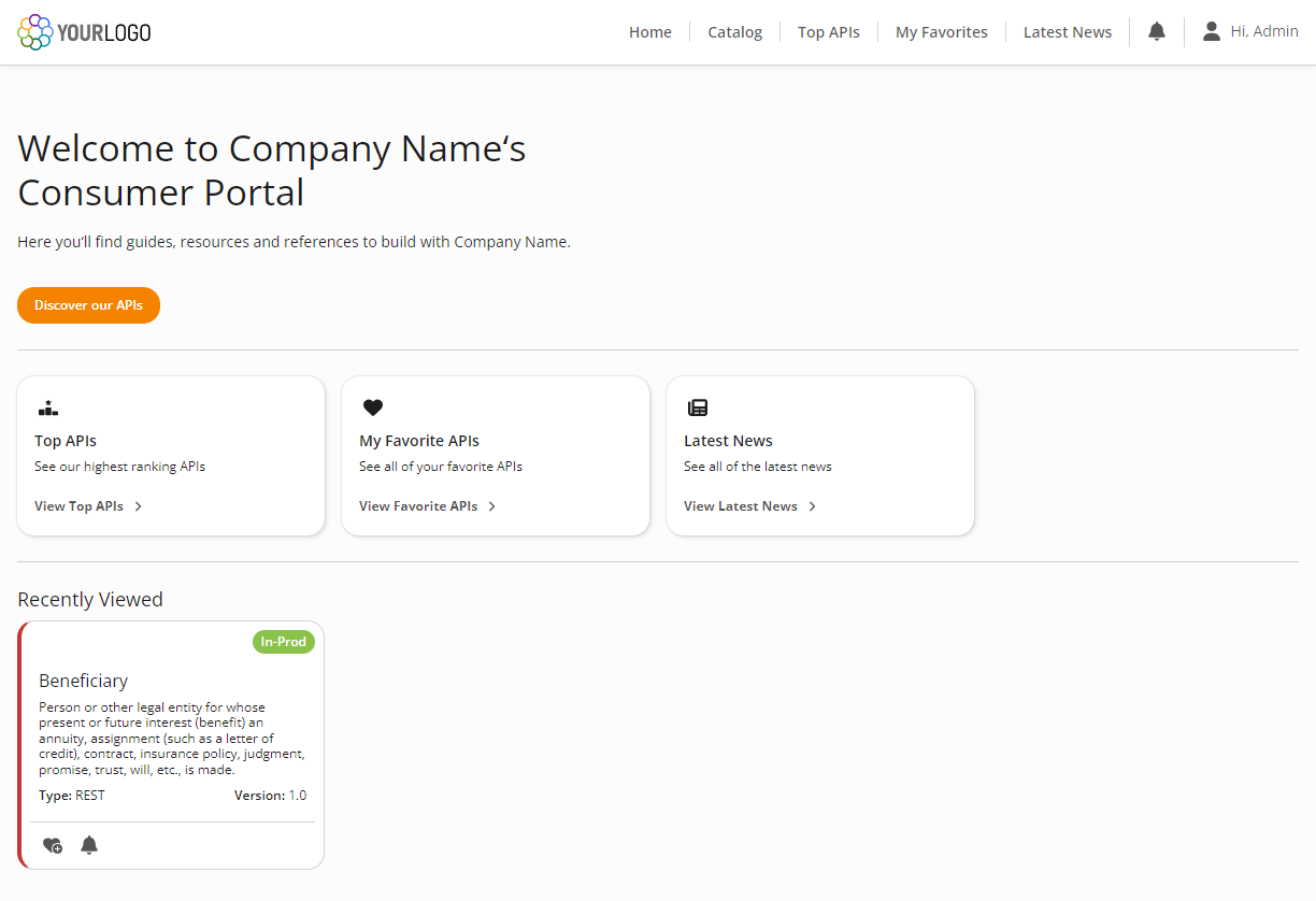
Example of Border Radius set at 16px
Additional Resources
Conclusion
It’s easy to customize the look and feel of your OIC portal, ensuring that your brand's identity is maintained.